

PERFUME MEDLEY – my original painting, not a photograph.
My motto as an illustrator was always “whatever works.” For me, that meant through experimentation I developed many shortcuts and ways of doing things that gave me the result I was looking for. Most everything I have learned, from art to music, even to computers, has been self-taught. It might be interesting to know that although I was a professional illustrator, I lived without creative passion for over twenty years. Initially, I used to contemplate beautiful portfolio paintings that I could create for my commercial portfolio. However, that stopped once I became an established illustrator. Over time, my illustrations simply became technical exercises for me. I was grateful for a career that allowed for me to create my own schedule. That flexibility was very helpful while raising my children.

An early watercolor done while learning the technique in college.
When I was younger, I did not have enough life experience to really connect with other people through writing. I certainly did not have the confidence to pursue any of my dreams of sharing music. However, I have always pursued my dreams as an artist. It started when I was very young. As a child, I remember my own mother telling me that being an artist was a wonderful career to have as a mother. I was in preschool when a teacher told my mother that I had artistic talent. From that time forward, both my parents nurtured it. I didn’t have any expensive art lessons. My parents simply provided me with materials and art projects that I enjoyed. I was a consummate “paint-by-numbers” artist. I remember patiently completing such an elaborate “doodle art” poster of fish, which still hangs on the wall of my old bedroom.

One of the few drawings I’ve done, which I find interesting.
When I was around ten-years-old, I became such a perfectionist that it became painful for me. I remember I would draw only one line, decide it wasn’t quite right, and then crumple the paper up. I went through many, many reams of paper. At that time, I decided that being an artist was frustrating and not much fun at all.
It was ironic that I was an artist who hated drawing. Though sketching was very frustrating, tracing came easily for me. And then there was an exception about drawing. I could easily draw mazes. My post about my mazes is at: #44 MY AMAZING JOURNEY.
I published my maze book at the age of fourteen and I dedicated it to the math teacher who had encouraged me. I didn’t make any significant amount of money from my “Maze Book,” but it was a great achievement in my young life.
After my book was published, I didn’t create mazes much anymore. In high school, I turned all of my attention from art to music. I stopped doing most artwork except for the enjoyable renderings that impressed my biology teachers. It wasn’t until I discovered watercolors in college, that art became part of my life again. I decided to become an illustrator after I took two, illustration classes as an undecided major in college. My first, paid illustration assignment resulted from one of those classes. The instructor had given our class an assignment for a medical magazine publisher. In 1980, my illustration was chosen for the cover of a medical magazine specializing in cardiology and I received $400.

My very first illustration in college for which I was paid $400.
How was it possible for me to be a mom, a wife, a daughter, and still have a successful illustration career? That is a very good question!
It is absolutely true that I was painting while my infant daughter was nursing at my breast.
I was illustrating after Jason died. Sometimes my tears would drop down onto my artwork. I always cover everything to prevent spills when I’m working. Sometimes, it was my own tears that spilled onto my work.
I began illustrating after I graduated with my Bachelors in Art 2-D from California State University, Northridge in 1981.
After I graduated, I developed a commercially oriented portfolio and within a few months I had some small assignments come my way. My first breakthrough assignment was an advertisement for a national product. I had one week to create a painting for which I was paid a significant sum of money. It was a lot of pressure for me and I experienced tremendous anxiety. I hardly slept that week.
I learned a valuable lesson about deadlines in my field when I realized there was always time left over for revisions if the client was unhappy. I never took an assignment with a deadline I could not meet. There were revisions on my first, big job, but I still managed to pull it off. When my painting was printed in the coupon section of the Sunday newspaper, it was very thrilling for me.

My first, big job.
Gradually, I received more and more assignments. Later on, I had several agents representing me in major cities of the country. I was usually busy working on one assignment, with several others waiting for me when my current job was completed.
For over two decades, I continued to produce my paintings. I was prolific and accomplished with my technique. Even so, there were always those occasional “nightmare projects.” I remember each one clearly and learned lessons from all of them. I was not so arrogant as to assume that my work was pleasing to everyone.

About six years ago, my career began to gradually fade away. When my parents became my responsibility, I was able to devote myself full-time to their care. All of my advocacy exhausted me, and I was fully into Zombieland. I was ready to let go of that additional pressure.
Because everyone was using computers already, the demand for a “quick turn-around was even greater. Prices were already half of what they used to be. Eventually, there were seldom calls for custom assignments. In the past, I used to have assignments waiting for me for as long as six months.
I appreciated that I could devote more energy to my family, especially my parents. I figured it was “meant to be.”

“Idealism and Photorealism”
My motto as an illustrator has always been “whatever works.” But my paintings always started out as a way to match a color and/or texture that was on my photo-reference.
I always say that the irony of my career is that:
I started out making paintings look like photos,
and now I’m taking photos to make them look like paintings!
When people look at my paintings, they often think they are photographs. My technique has always involved using photos as reference. However, they are still paintings.
Later on, I will share more about my own “rules of illustrating.” One rule that I have (remember, this is my rule only) is:
There is nothing wrong with tracing.
The reason that my subject matter gravitated from doing medical magazine covers to food and flowers is quite simple. I have easy accessibility to photo reference for food and flowers.
My greatest challenge has been illustrating something I cannot look at or photograph. I have become quite resourceful in creating reference photography for myself. That is another area that I look forward to sharing.
One of the ways I like to view my paintings is not to say they are “photorealistic.” I prefer to call them “idealistic.” I want my fruit to be perfect; the ideal. As I’ve developed my paintings, sometimes I’ve gone more toward including blemishes on fruit – I’ve made them less idealistic!
Perhaps that’s because it feels just like me. I am older and more blemished, too.

DESSERT MEDLEY – copyright by Judy Unger, 2009
“Transparency is my ideal in creating colors”
Working transparently vs. opaquely is basically the difference between having colors that are “clear” vs. those that cover other colors and can be mixed with white paint. In my later years, I have often gone to a more opaque method to create unique textures. It is subtle, and is generally not used throughout much of my painting.
I prefer transparency with color, and utilize transparent painting even when using opaque mediums. That means that I glaze with acrylics when I use them.
Transparent color was always my ideal. Transparent color is a lot like looking through stained glass windows. Each veil of color subtlety alters the color it overlays. The most brilliant white is achieved by leaving the paper white. I always preferred painting transparently and my favorite medium was water-based dyes. Even when I used opaque mediums, I still worked transparently. That meant I glazed when using acrylics; painting with thin washes of color instead of thick gobs of paint.

“Taking stock of my situation”
Well, the fates have allowed my career to be there for me throughout many of my “trials and tribulations.” However, with the advent of computers and stock illustration – the demand for illustration has been “phased out.” I knew things were serious when most of the artist representatives gave up their businesses first. Then, 90% of the agencies I used to work with closed. After that, there were fewer and fewer artists surviving only on illustration assignments.
As stressful as illustrating was for me at times, I have loved the entire process. It has been an artistic journey of self-discovery from the very beginning. I finally reached a pinnacle of mastery over the watercolor and marker technique. And then it was all over!
There was no avoiding becoming digital any more because now I had a lot of time on my hands. I knew I definitely had to figure out how to use the computer for my artwork. The process took years and years, and I didn’t rush it. I started off very slowly.
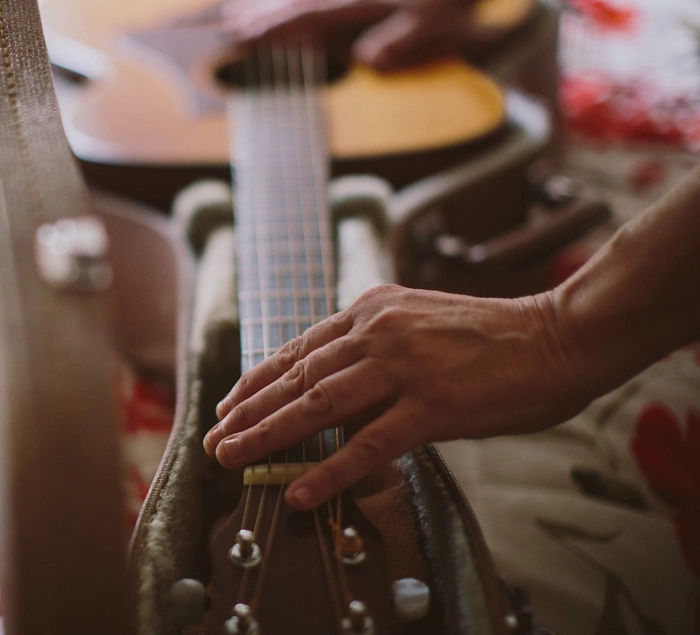
When I hold a stylus, it has not replaced the feeling of a paintbrush. I can look at my thumb to see a very large callus from all the painting I used to do. I hardly ever hold a paintbrush anymore. I still have a large callus on my other thumb from the years when I played classical guitar.
I create beautiful artwork, but my hands are not that attractive. Unfortunately, I do bite my nails!

Even though I utilize the computer for illustrating now, I do not create paintings that are “totally from scratch” on my computer. I combine elements of prior paintings, as well as photography. I create an image on my computer that I am satisfied with. After that, I create a light print upon rag watercolor paper, upon which I overlay watercolor washes, as well as sometimes acrylic, and colored pencil.
This has been exciting for me in two ways. First of all, I dislike sketching and drawing. My print version helps to set my “road map” in place. Second, I have a great idea of how my final version will look. I have solved all the composition issues.
When I used to create a painting, there was a lot of stress related to uncertainty about the best possible composition. With my computer, I can know exactly what is the best placement for every ingredient. It also helps that I can instantly share this with my clients.
Ironically, the computer has been wonderful, while at the same time decimating the need for an illustrator like me.
However, with age and the resulting changes in my vision, I appreciate how much less stress it has been utilizing the computer. I do miss holding a paintbrush, however, now that I’m fifty I can honestly say that it’s a lot easier to see the close up pixels on a computer – rather than squinting through those damn reading glasses.
I now have what I deem a “library of images” for my medley of ingredients. I certainly have a lot of work over the past twenty-eight years to literally “draw from.” Using my scanner, touch up skills, and intuition, I’ve put in thousands of hours to create my “library of images.”
While I created my library, I wondered whether it was worth it or whether it would pay off. It didn’t matter, because now that I’ve done it – I’ve learned all the skills I needed to for mastery of the computer. I receive a lot of requests for images, and my hundreds of stock images are available for sale internationally on the web. Also, any royalties from stock can continue indefinitely; the work is all done, which is nice.
Unfortunately, illustration stock prices are ridiculously low and have not translated into any significant amount of income for me. All of my photographer friends understand this downward spiral of prices for stock. Paintings that were originally thousands of dollars, now sell for $10 on a stock image site. Sadly, some even sell for less than that.
My new way of looking at my paintings is to view them as a medley of ingredients; I deem my art “reconfigured illustrations.”
I still have the ability to quickly create custom work. Maybe someday, I’ll create new imagery. But I’ve always thrived on assignments. I’ve never felt like creating a painting for myself. When someone is willing to pay $7,000 for a painting, I am ready to create anything that will make my client happy.
An assignment is a project with perimeters. Those perimeters become my puzzle to solve. Without an assignment, there are too many possibilities for me. The challenge for me has always been to follow the structure and instructions I have been given. I want very much to please the art director and the hoard of numerous other people involved giving their opinions!
There was a very special evening where I was honored, which Jason attended shortly before he died. Every year, I entered the annual illustration contest for the Society of Illustrator’s of Los Angeles. That year, my favorite painting of a Snicker’s Bar won a gold medal in the unpublished category. I was often told my painting made art directors hungry and it was an excellent promotional piece for me. That night where I shared my excitement of that honor with my parents, husband, and Jason I would always remember.


It was so beautiful having Jason there to share my excitement of winning an illustration award.

When I began to about write my life, I shared a lot about my illustration career. It was very gratifying to know that even though my career faded, it was possible for me to resurrect it by sharing and writing about the experience. No longer had it simply disappeared into nothingness, and it had value in a different way than before.
As an illustrator, I had a gift for creating any color I desired. I enjoyed the challenge of replicating areas of interesting textures that were on my reference photos. I also loved contrast and often used extreme dark and light whenever possible on my illustrations. I usually mixed many colors together to get dark shadows, rather than use black.

I love to add purple into shadow areas.
In fact, in order to achieve realism when working with my brightly colored dyes, it was important to dull colors down quite a bit. I remember well teaching a painting exercise for my illustration students utilizing complementary colors.
An orange was given an under-painting using green tones.
A banana was given an under-painting using purple tones.
Once the under-painting was done, the pure vibrant color could be painted over the under-painting as an overlay. It was a fun process to teach, because my students were so excited to see something come to life in front of their eyes.

I have probably illustrated more fruit than anything else.
I am now finding great insight into how applicable my art lessons are to my life as well.
If all colors are brilliant, nothing stands out. The brilliance is only possible through having the depth and richness of colors that have been mixed into subtle, dull variations. The same thing applies to contrast. The brilliance is only possible through having the depth and richness of darks and lights!
In life, we cannot have everything purely colorful or purely bright either. It is the contrast and the dullness that allows for appreciation of sparkling beauty; it allows for it to be emphasized!
I found great insight into how applicable my art lessons were to my life, as well. If all colors were brilliant, nothing in my painting stood out. The brilliance was only possible through having the depth and richness of many other colors mixed into subtle, dull variations. The same thing applied to contrast. The brilliance was only possible through having the depth and richness of darks and lights.
This was a metaphor for me because nothing in my life was ever purely colorful or purely bright. It was the contrast and the dullness that had allowed for my appreciation of the sparkling beauty that surrounded me.
I learned so many things by being an artist. I’ve never defined success as making a lot of money; I felt successful when I had my maze book published and I received very little money for it. I’ve had posters, prints and even towels with my work on it; those projects paid very little but I was very proud to see my work displayed.
I never dreamed that I would pursue art as a career; I excelled in other areas besides art. But with dedication and commitment, my dream became a reality. I was very resourceful as an illustrator, and I enjoyed the many challenges I faced during my career. Seeing how much I improved was very gratifying. I went from being an artist who disliked drawing, to an artist who loved painting. I had tremendous satisfaction when I completed assignments that pleased my clients.
But I am far more passionate about my writing and music than I ever was about my artwork. Perhaps the difference is that I am not seeking to satisfy anyone other than myself. I might never have imagined I’d be a successful artist, but in contrast, I feel very positive that with my music and writing I will touch and heal many people. But most importantly, I have certainly healed myself.

© Judy Unger and http://www.myjourneysinsight.com 2010. Unauthorized use and/or duplication of this material without express and written permission from this blog’s author and/or owner is strictly prohibited. Excerpts and links may be used, provided that full and clear credit is given to Judy Unger with appropriate and specific direction to the original content.


Awesome, AWESOME work. Very interesting read – & I can’t believe you didn’t have confidence as a kid. What artistry! Just terrific.
LikeLike
Thank you for your beautiful comment, Noeleen. I enjoy your writing, which comes deeply from your heart. So your compliment means a lot to me. I appreciate your reading this!
LikeLike
Very detailed post. You have certainly experienced a wide variety of change through the years. Your art is terrific! Thanks for stopping by my blog 🙂
LikeLike
thanks for reading-i enjoy your work as well. beebeesworld
LikeLike
These are amazing!
LikeLike
Thank you so much, Kathy! You made my day. 🙂
>
LikeLiked by 1 person
You are the most talented, beautiful person! You’ve had an AMAZING journey! I cannot believe how incredible all this artwork is. WOW! (The flower picture really cracked me up. At first I did not see the kitty in the window. Then when I did see Kitty, I was so delighted. Kitty looks just like Marshall’s cat, Cliff. Cliff passed away a number of years ago, but he was one of the best, smartest cats EVER! I think of him often and miss him. 🤍
LikeLiked by 1 person
Thank you so much, Stacy! What a special kitty Cliff was. He was a special connection to Marshall and that alone is so touching. I appreciate your comment and your compliments!
LikeLike